- From
- Artrix Studio
- To
- Artrix Studio (yes, ourselves)
- Subject
- Your homepage review: artrixstudio.com
- Looked at
- The artrixstudio.com homepage in Chrome, laptop 1440 px and phone 390 px, light and dark theme
Homepage review: artrixstudio.com
We run the same review on our own homepage before we ask you for yours. Here is the latest one — five things we found, why each one matters, the fix, and what we changed because of it. Each finding ends with the numbers from after the fix, measured the same way as before.
Hello (to us),
The good news first: even before these fixes, Google Lighthouse liked this page — 92–93 on a phone and 99–100 on a laptop for performance, 100 for best practices and SEO. That is also why this review was worth doing. Lighthouse loads the page once and stops; it doesn’t scroll, and it doesn’t stay. The two heaviest problems we found only show up when you do both, which is what a visitor does. The other two are things you only see by looking: a card that runs off a phone screen, and small text that is too faint.
What we found
The headline didn’t say who it’s for or what you get
What we saw
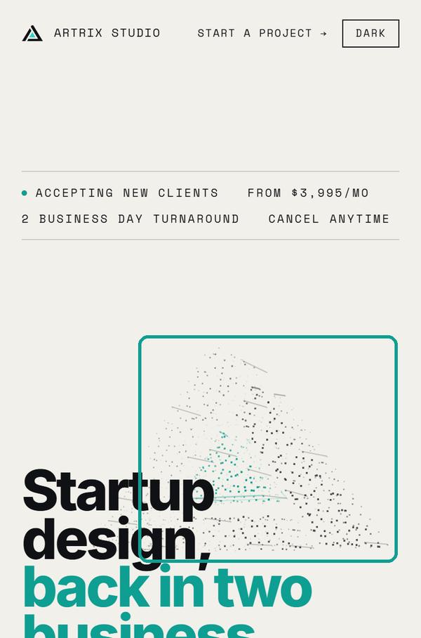
The first version opened with Stop waiting on design. Ship faster.
Read cold, that could be any studio’s line: it names neither who the studio is for nor what arrives. Two more things were buried: one-off projects were only mentioned near the bottom of the pricing section, and the price of the job most founders come for — a new site plus a raise deck — sat inside an FAQ answer.
Why it matters
The first line decides whether anyone reads the second. A buyer who can’t tell in a few seconds that this is for them, and roughly what it costs, leaves; the answers further down never get read.
What we’d do
Say the audience and the promise in the headline, name every way to buy in the line under it, and lift the most common job and its price out of the FAQ.
Fixed
The headline now reads Startup design, back in two business days.
The line under it names both plans and a fixed-price project
. The site-plus-deck price (about $12,990 over six weeks) now has its own card under the plans, with a week-by-week plan behind it.
On a phone, the particles keep drawing after you scroll past them
What we saw
The hero builds the Artrix mark out of particles: 1,100 of them on a phone, 3,400 on a laptop, redrawn on every frame. On a phone the field fades out once you scroll past the hero — but only the picture fades. The drawing loop runs every frame for as long as the page is open, visible or not. It also doesn’t check whether the visitor has asked their phone to reduce motion.
We slowed Chrome’s processor down four times to stand in for a mid-range phone, waited for the intro to settle, and watched the main thread for 10 seconds at a time. In the hero it was busy about a third of the time; with only the particle script blocked, 8%. Further down the page, with the field faded, it was still 16–24% against 8%. Two runs each; the table has both.
One more detail: on a phone, the field comes back at 28% opacity behind the pricing section. A later rule for laptops (body.past-work #field{opacity:.28}) wins over the phone’s opacity:0.
Why it matters
None of this counts as “blocking time”, because each frame is short — which is why Lighthouse doesn’t flag it (0–90 ms). But a quarter to a third of a phone’s main thread spent on decoration nobody is looking at is battery and heat, and less room left for scrolling and taps. On a page that sells speed, the page itself shouldn’t be doing slow work in the background.
What we’d do
Stop the loop when the canvas can’t be seen: cancel the animation frame when the hero leaves the screen (an IntersectionObserver on the hero, or the past-hero class the page already sets) and restart it on the way back. With prefers-reduced-motion, draw the mark once and don’t animate it. Keep the laptop’s 28% rule to laptops (min-width:761px).
Fixed
The loop now draws nothing once the phone field has faded, and the phone’s opacity:0 wins again. Same test, before → after:
- Main thread busy, pricing
21–24%→ 7–8% - Main thread busy, work section
16–23%→ 10–12% - Field opacity behind pricing
28%→ 0
With the particle script blocked, the same places measure 7–10%, so the faded field now costs next to nothing. The loop now also checks for reduced motion: with it asked for, the hero measures 5–9%, about the same as with the particles blocked (6–9%). The hero itself is unchanged at 31–32% for visitors who haven’t asked for less motion; that is the animation doing its job, on screen.
Before the fix: main thread busy, 10 s windows
| Where | As is | Without |
|---|---|---|
| Hero | 32–33% | 8% |
| Pricing | 21–24% | 8–9% |
| Work | 16–23% | 8% |
390 px phone, Chrome CPU slowed 4×, two runs each. “Without” blocks the particle script (field.js) in the test browser only. The field is at 28% opacity at pricing and faded out at work. Long tasks over 50 ms: none in any window.
On a laptop, the 3D walkthrough keeps running long after it’s off screen
What we saw
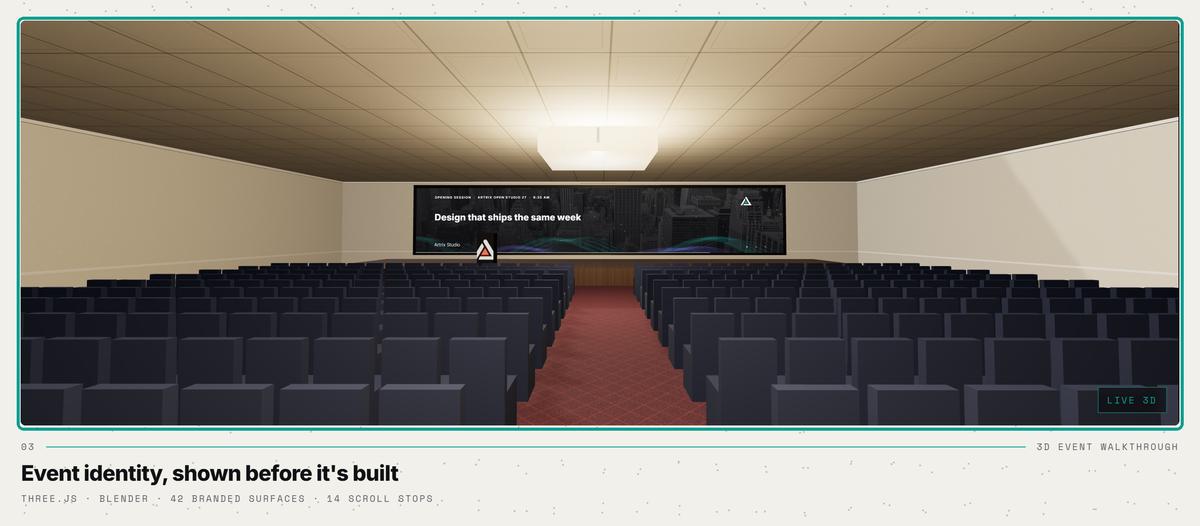
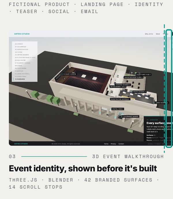
When the work section scrolls into view, the event walkthrough card swaps its screenshot for the live 3D scene. That is a nice touch, and it waits until it’s needed. But it brings 34 files and 5.2 MB with it — 2.3 MB of textures, 1.4 MB of three.js and loaders, a 1.4 MB model — while the whole homepage is 0.7 MB on arrival.
Once started, the scene never pauses. We scrolled on to the pricing section, three sections past the card, and measured for 8 seconds: the main thread was busy 43% of the time (3.4 s), and 47% at the FAQ. At the top of the page, before the scene loads, it was 10%. The profile is mostly three.js preparing frames nobody can see. This was in a visible Chrome window on a desktop graphics card (RTX 3080), so it is script work, not a slow GPU. With the particles blocked, the pricing number didn’t drop, so this one is all the walkthrough.
Why it matters
The visitor reading our prices has a 3D renderer running out of sight: fans, battery, and less smooth scrolling on an ordinary laptop. The 5.2 MB is seven times the page itself, spent on everyone who scrolls past the work, including people who never look at that card.
What we’d do
Pause the scene when the card leaves the screen: watch the card with an IntersectionObserver, stop the scroll-driving loop and the scene’s own render loop, and start both again when it comes back. Better still, keep the screenshot until someone hovers or clicks (“Play the walkthrough”), so the 5.2 MB is only fetched for people who asked for it. And check that the live server sends three.js compressed.
Fixed
It took two tries. First the page hid the walkthrough (display:none) when the card left the screen. That didn’t stop it: in Chrome, the hidden walkthrough’s own animation loop kept running and drawing (20,000–28,000 WebGL draw calls a second), and the main thread at pricing measured 37–79%. Now the walkthrough has a pause switch, and the page flips it when the card leaves the screen. Before → after:
- WebGL draw calls per second, card off screen
20,000–28,000→ 0 - Main thread busy at pricing, profiler runs
43–50%→ 7–8% - Main thread busy at the FAQ
47%→ 7% - Main thread busy at pricing, our longer test
39–44%→ 8–20% - Download once the work section is on screen
5.2 MB→ 0 until you hover the card
Back on screen, the walkthrough picks up again. In the longer test, blocking the particle script brings pricing down to 2–3%, so what is left there is the laptop’s faint particle field behind the prices, not the walkthrough. We then went one step further: the 5.2 MB walkthrough now loads only when someone hovers its card, so scrolling past the work costs nothing.
Laptop, 1440 px, first review
| Homepage on arrival | 0.7 MB |
| Walkthrough, once the work section is on screen (34 files) | 5.2 MB |
| Main thread busy at the top (before the scene loads) | 10% |
| … at pricing, three sections past the card | 43% |
| … at the FAQ | 47% |
Sizes as our server sends them. Busy time over 8 s windows in a visible Chrome window.
On a phone, the 3D walkthrough card runs off the right edge
What we saw
Every other work card fits the column: 350 px wide on a 390 px phone. The walkthrough’s picture is 416 by 260 px at every screen width up to 900 px, so on a phone it runs 46 px past the right edge and its right side is cut off. On a 768 px tablet the same small picture sits in a 704 px card, with an empty strip beside it. We checked 375, 390, 414, 700 and 768 px.
The cause is two CSS rules. The full-width card has a fixed height, .bento .piece.full .piece-shot{height:clamp(260px,32vw,480px)}, which applies at every width and beats the phone rule’s height:auto. With a 16:10 ratio, 260 px of height forces 416 px of width. overflow-x:hidden on the page stops it from scrolling sideways, which hides the problem instead of fixing it.
Why it matters
It is the only piece of work that looks broken on a phone, and it is the 3D piece, the one meant to impress. A prospect judging a design studio on their phone notices a cut-off card before they notice anything else about it.
What we’d do
Add .bento .piece.full .piece-shot{height:auto} inside the max-width:900px block (or move the fixed height into a min-width:901px query). We tried it in a test browser: the card becomes 350 × 219 on a phone and 704 × 440 on a tablet, the page is exactly 390 px wide again, and the laptop layout doesn’t change.
Fixed
The height rule is now reset on screens up to 900 px. Before → after:
- Picture on a 390 px phone
416 × 260→ 350 × 219 - Past the right edge at 390 px
46 px→ 0 - Page width at 375 / 390 / 414 px
436–437→ 375 / 390 / 414 - Picture on a 768 px tablet
416 wide→ 704, fills the card
Picture width vs. its card
| Screen | Card | Picture |
|---|---|---|
| 375 px | 335 | 416 |
| 390 px | 350 | 416 |
| 414 px | 374 | 416 |
| 768 px | 704 | 416 |
| 390 px, with the fix | 350 | 350 |
CSS pixels, measured in Chrome. At 390 px the page reports itself 436 px wide.
Some small text and links are too faint to read comfortably
What we saw
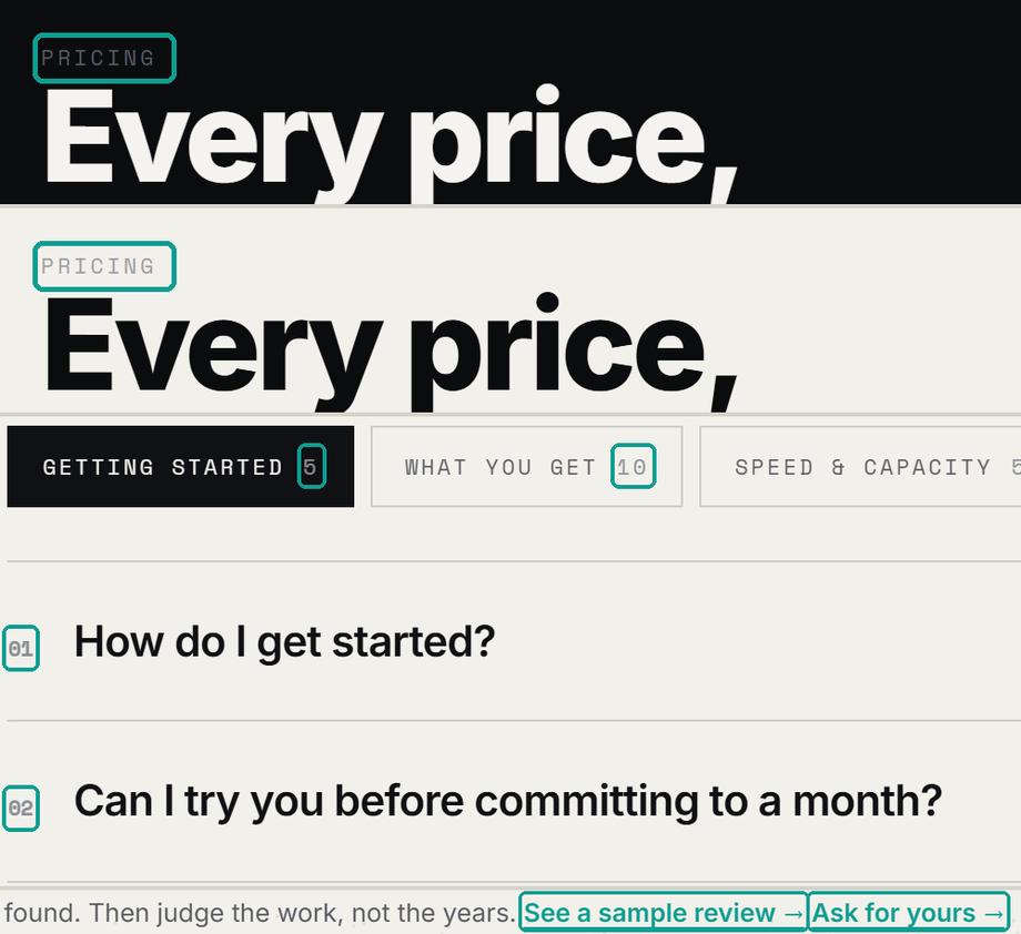
We computed the contrast of every piece of text on the page, in both themes, after every fade-in had finished. In the light theme, the small gray (#8D8F96 on paper) is 2.83 to 1: the FAQ numbers, the counts on the FAQ tabs, the note under the budget bars, and the footer links. Teal text on paper is 2.91 to 1, including the two links on “Proof before you pay”: See a sample review
and Ask for yours
. In the dark theme the same small gray is 3.37 to 1.
The “Pricing” label is the odd one out. The pricing panel flips color with the theme, but its label keeps the rest of the page’s gray: 2.93 to 1 on the dark panel, 2.37 to 1 on the light one. The usual standard (WCAG AA) asks for 4.5 to 1 at these sizes. Lighthouse flags the gray text on both runs, and the teal links and the Pricing label on the laptop run; with the missing landmark below, that is why accessibility is 94 and not 100.
Why it matters
These are the small labels people steer by: which FAQ tab has what, where the terms are, and above all the links to the free review, the offer we most want clicked. Faint text is the first thing lost on a bright screen or to weaker eyes.
What we’d do
Light theme: small gray to #6A6C72 (4.6 to 1) and teal text to #0B6F66 (5.3 to 1); the bright teal stays for fills and lines. Dark theme: small gray to #7C7E84 (4.8 to 1). Give the Pricing label the panel’s own gray (--panel-fg2): 7.2 to 1 on the dark panel, 7.5 on the light one.
Fixed
New colors are in. Before → after, measured on the page after every fade-in:
- Small gray, light theme
2.83→ 4.61 to 1 - Small gray, dark theme
3.37→ 4.82 to 1 - “See a sample review” and “Ask for yours”
2.91→ 5.30 to 1 - Pricing label, light / dark theme
2.93 / 2.37→ 7.24 / 7.53 to 1 - “Why trust a studio” numbers 01–04, light theme
2.91→ 5.30 to 1 - Teal half of the hero headline, light theme (large text, needs 3)
2.91→ 4.39 to 1 - Lighthouse accessibility, phone and laptop
94→ 100
One went the wrong way at first. In the dark theme, the count on the selected FAQ tab (the “5” on “Getting started”) briefly took the page’s text color — also the selected tab’s background — and disappeared. Lighthouse runs in the light theme and didn’t catch it; our own check did. We put the tab’s dark ink back and raised its opacity from .55 to .7: 7.1 to 1 in the dark theme.
Speed
Google Lighthouse, two runs each on phone and laptop, before → after the fixes:
| Lighthouse | Phone | Laptop |
|---|---|---|
| Performance | ||
| Accessibility | ||
| Best practices | ||
| SEO | ||
| Main content shown (LCP) |
Measured 28 Sep 2026 with Lighthouse 13.5 (its standard simulated mid-range phone on a slow mobile connection, and its desktop setting), two runs before the fixes and two after (taken before the walkthrough’s pause switch and the last color changes, which Lighthouse wouldn’t see anyway: it doesn’t scroll to the walkthrough, and it didn’t flag those colors). Scores move a few points between runs, so we show the range of the two; the phone’s performance score moved 8 points between the two runs after. On the phone runs the page transferred 1.1 MB in 20 requests before and 1.3 MB in 21 after; the difference is a new work image (167 KB) added since the first review, not the fixes. Lighthouse doesn’t scroll, so it never loads the 3D walkthrough and never sees findings 1 and 2 in full.
Smaller things
- Work images are bigger than they’re shown. The seven cover images are 1.0 MB together, at 1,400–1,920 px wide. Four of them appear as 243 px thumbnails on a laptop and 168 px on a phone; a copy at twice the shown size would be a fraction of the weight. Not changed yet An eighth cover image (167 KB, 1,920 px wide, shown at 192 px) has been added since.
- The images have no width and height. Layout shift is tiny today (0.001–0.004), but setting them keeps it that way. Not changed yet
- There is no
<main>landmark. Lighthouse flags it on both runs; screen-reader users use it to skip straight to the content. Fixed The page has one now, and Lighthouse no longer flags it.
What we changed because of it
- The walkthrough card on phones: one line of CSS. It fits the screen at every width we checked. Fixed
- Pause what nobody can see: the particles stop once the hero is gone and respect reduced motion, and the 3D scene pauses when its card is off screen (hiding it wasn’t enough; it needed its own pause switch). Fixed
- Darker small text: the gray, the teal text and the Pricing label now pass, and Lighthouse accessibility went from 94 to 100. One count on a selected FAQ tab disappeared in the dark theme along the way; we caught it and fixed it (7.1 to 1). Fixed
- A
<main>landmark. Fixed
We measured everything again after the changes, the same way as the first time; the after numbers are in each finding. If you send us yours, everything in your review is yours to use, whether or not we work together.Artrix Studio
How we checked: we opened the homepage in Chrome at 1440 px and 390 px, in the light and dark themes, scrolled through the whole page, and waited for every fade-in and intro to finish before measuring anything. Main-thread numbers are from Chrome’s own counters and profiler; the phone runs slow the processor down 4×. After the fixes we ran the same scripts again on the same machine the same day. The screenshots show the page as we first found it; each is cropped from the page, and the teal boxes are ours.