What changed: The logo-only title becomes a cover that says what this is, set in Front's current purple and lime.
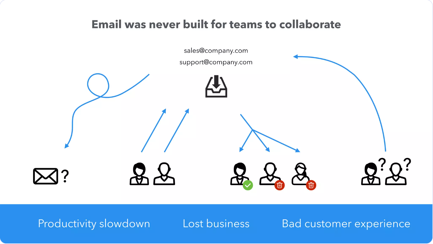
What changed: The pictograms are redrawn as one flow out of the shared inbox, and the three outcomes become the row you remember.
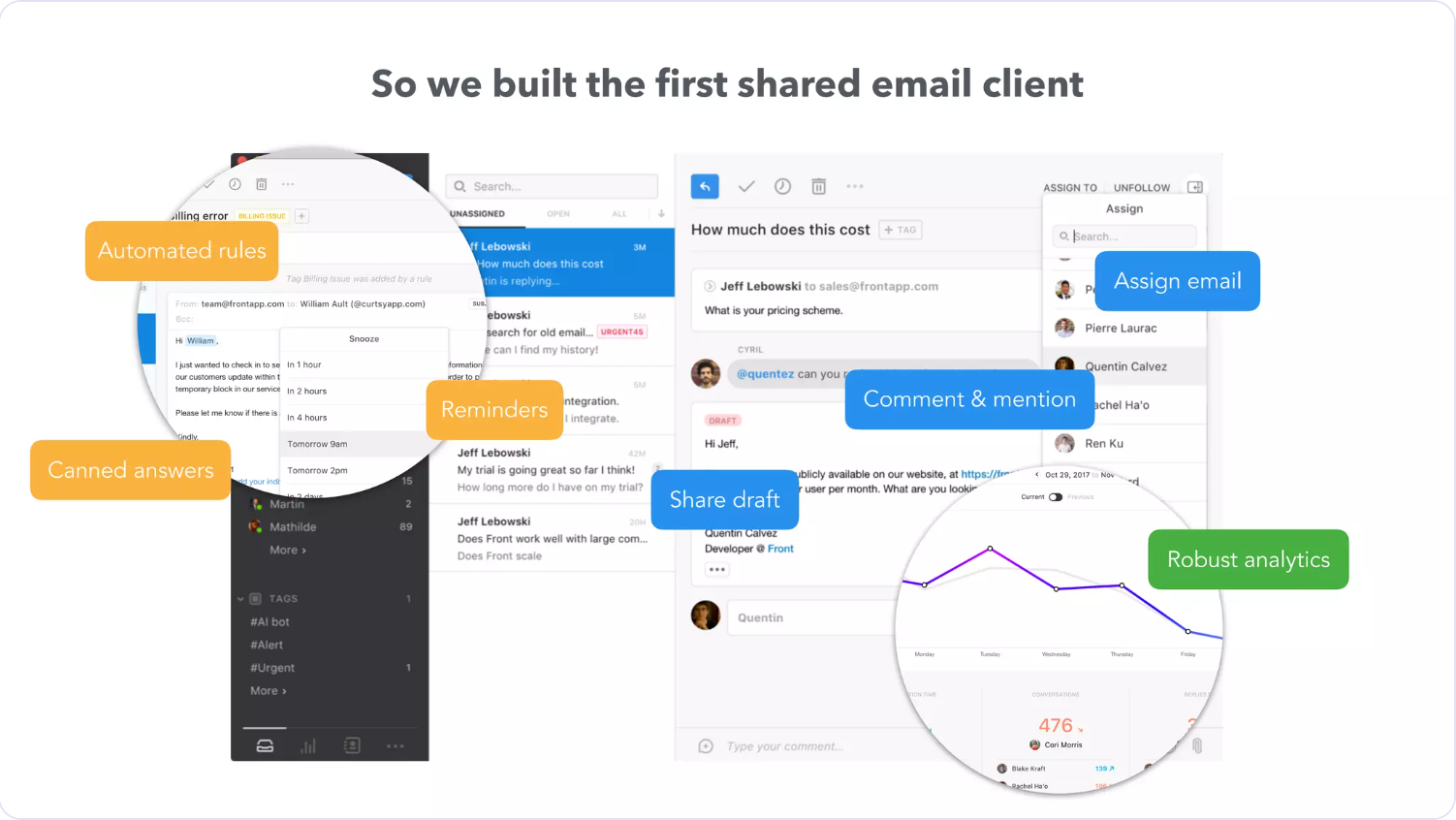
What changed: A dense 2018 screenshot with seven floating stickers becomes a simplified interface with numbered pins and a feature list you can read.
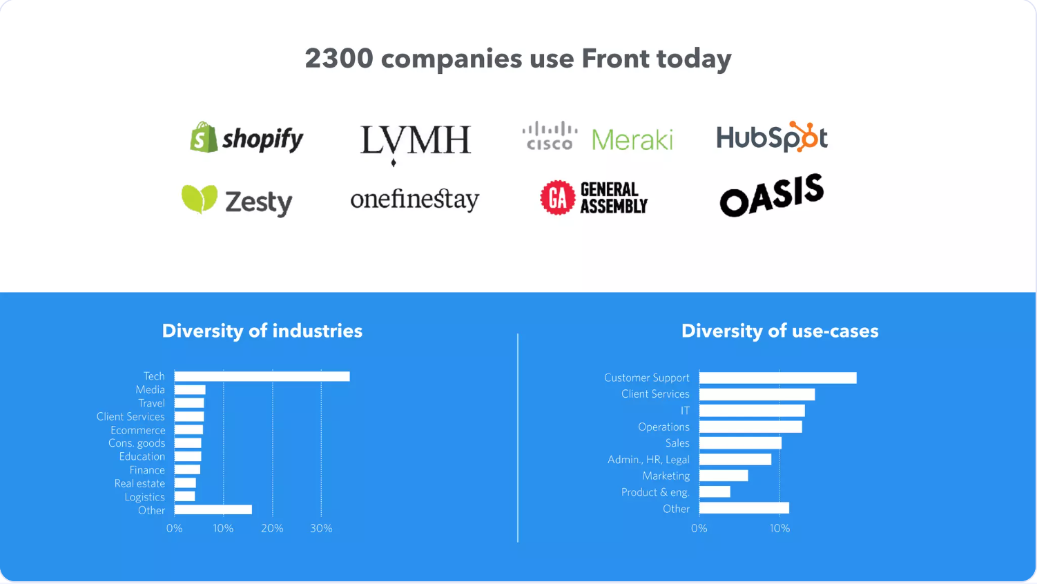
What changed: The 2,300 figure now leads the slide; logos are set as type, and each bar chart highlights its leader (Tech, Customer Support).
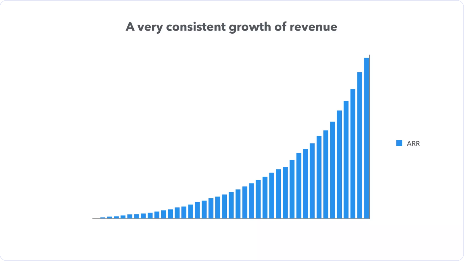
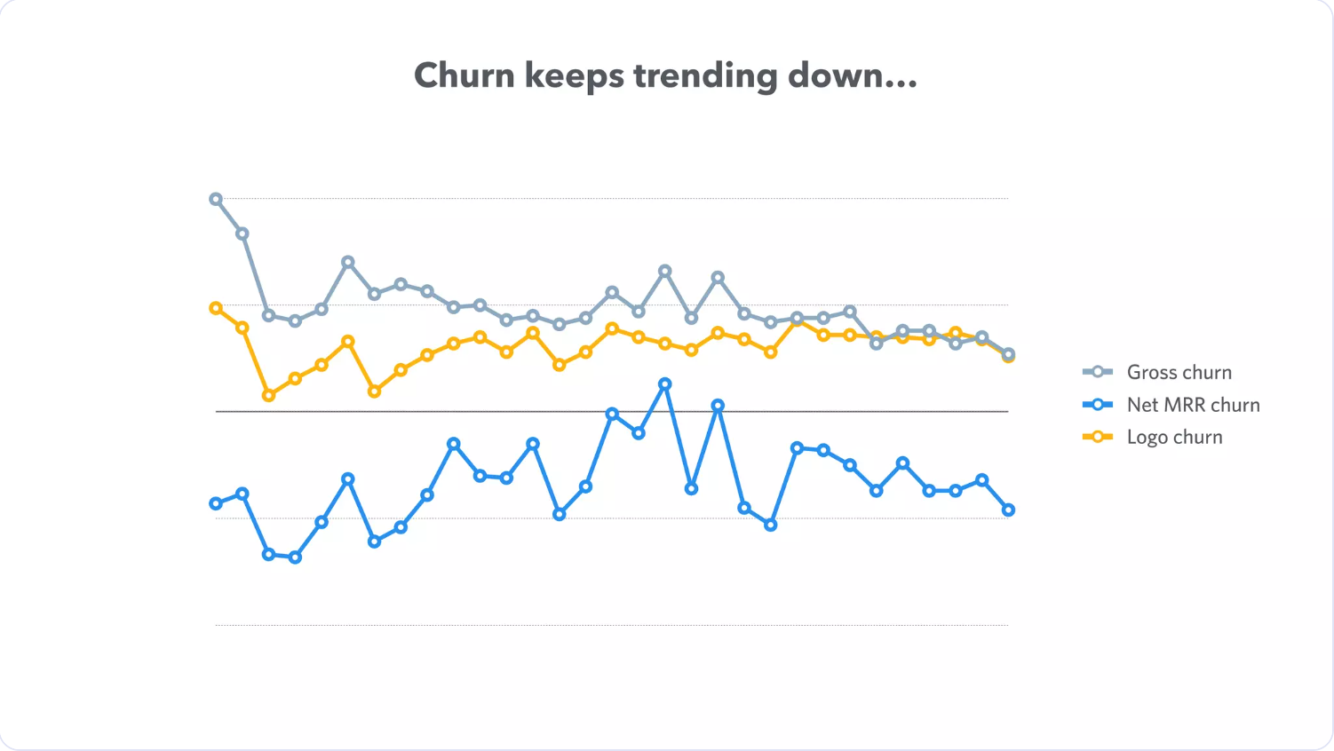
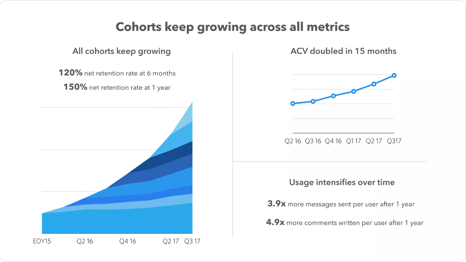
What changed: Two bare charts on two slides become one story, with the claim in the headline and a caption that says plainly what isn't published.
What changed: Each panel now leads with its figure, the numbers count up to the published values, and the usage multiples get bars drawn to scale.
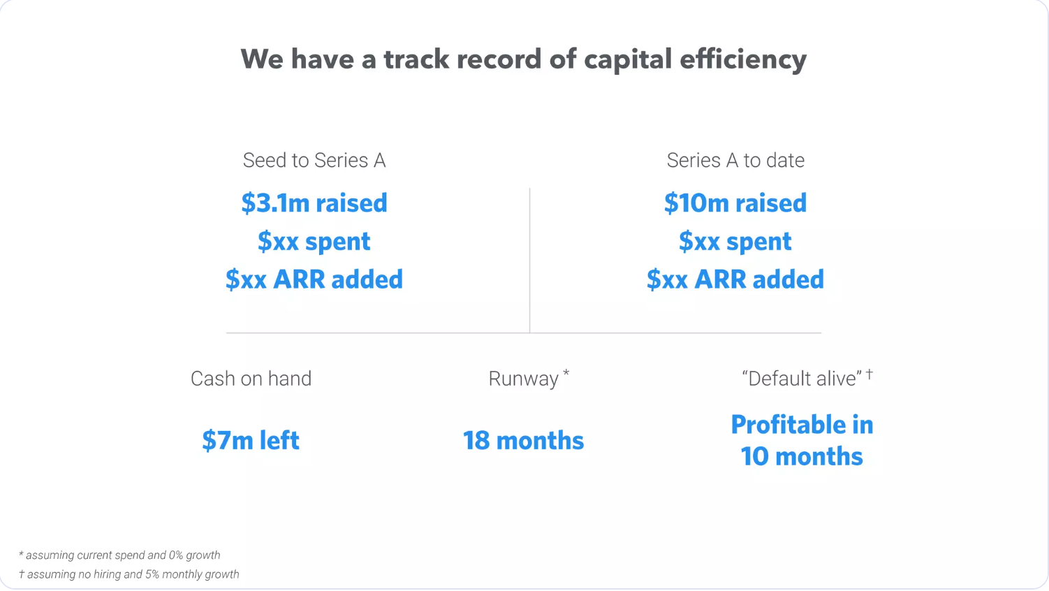
What changed: Every figure was the same blue at the same weight; now “default alive” leads, runway and cash follow, and the masked amounts read as masked.
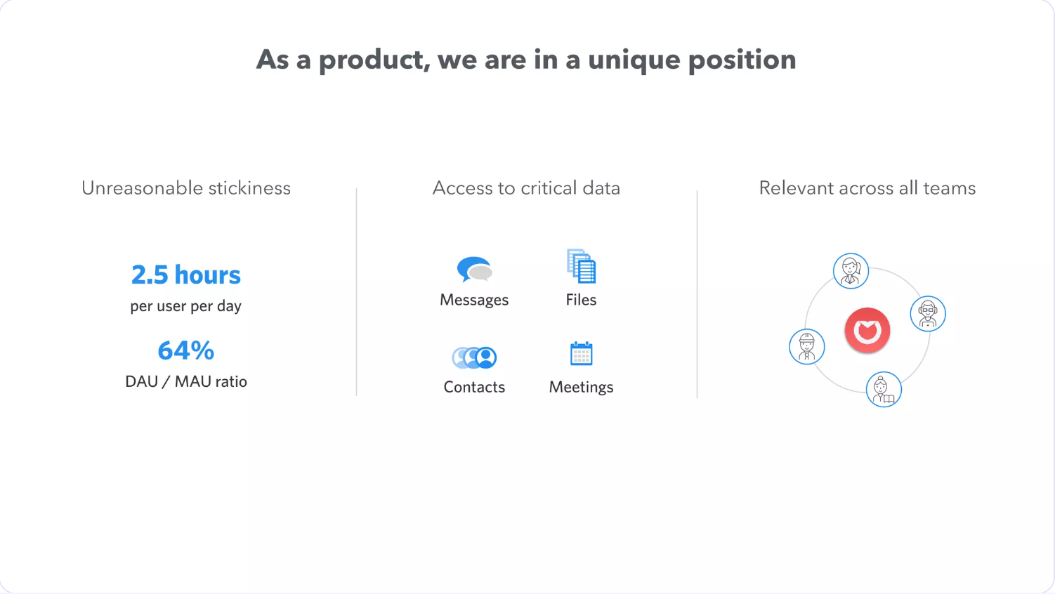
What changed: Mixed clip-art becomes one icon set, the three columns become cards of equal weight, and 64% DAU/MAU is drawn as a gauge.
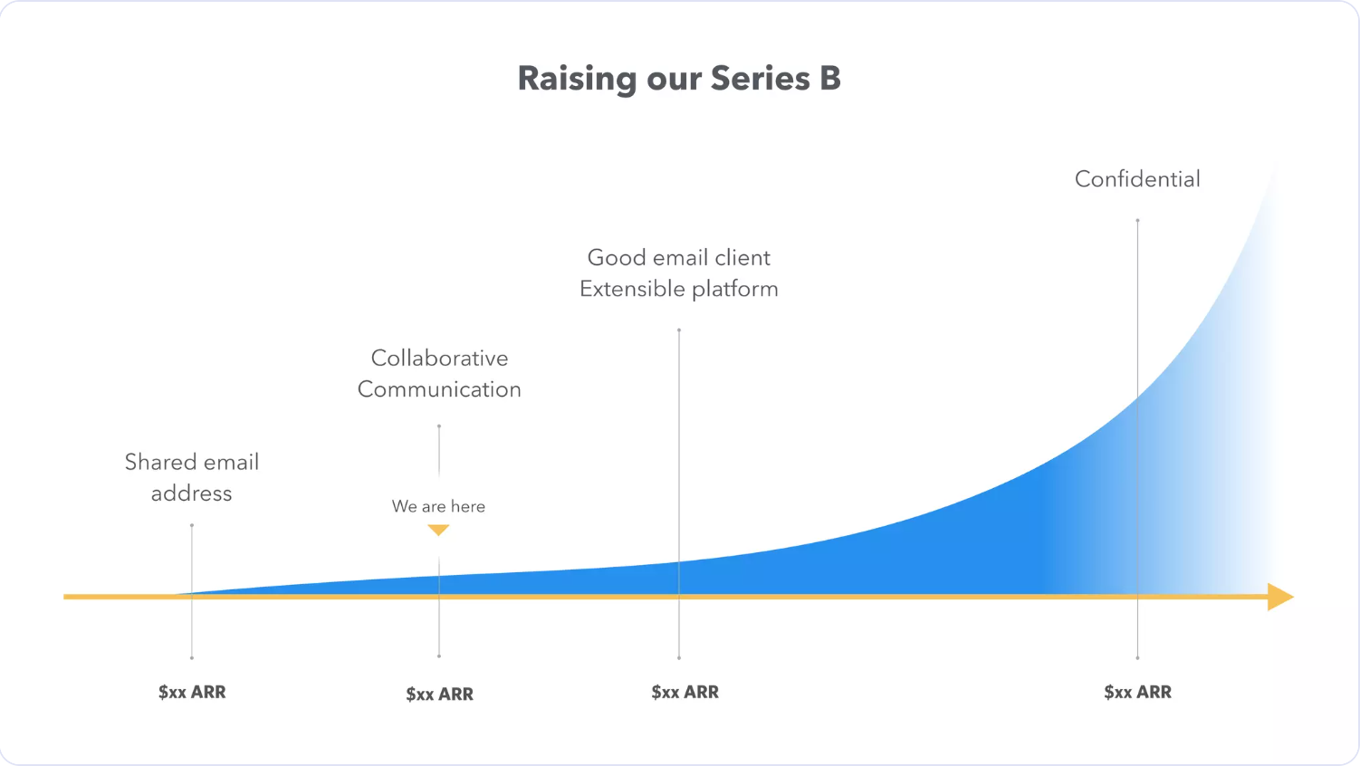
What changed: The curve now separates what's done (lime) from what's next, so “We are here” is the first thing you see.
What changed: A plain “Thanks” becomes a recap of the four numbers worth remembering, each exactly as published.